How to Create Beautiful, Animated Link Tooltips Using CSS3 and jQuery (2026 Updated Tutorial)
2 minggu ago

Tooltips are small pop-up boxes that appear when users hover over a link, button, or element. They provide extra context, explanations, or helpful hints without cluttering the main interface. While native browser tooltips (from the title attribute) are simple, they lack customization, branding, and smooth animations.
In this comprehensive guide, we’ll build custom, animated link tooltips using pure CSS3 for styling and arrows, plus a touch of jQuery to handle display, content population, and mouse-following animation. This approach remains SEO-friendly because we leverage the existing title attribute.
The tutorial covers:
- Creating tooltip shapes and directional arrows with CSS borders and pseudo-elements
- Using jQuery for hover events, dynamic content, and smooth positioning
- Animating the tooltip fade-in and mouse tracking
- Modern 2026 best practices: accessibility (ARIA), responsive design, and performance
This method is lightweight, works well across modern browsers, and enhances user experience without heavy frameworks.
Start with a basic HTML document. Include your main stylesheet and the jQuery library (use a CDN for simplicity, or host it locally).
<!DOCTYPE html>
<html lang="en">
<head>
    <meta charset="UTF-8">
    <title>Custom Link Tooltips with CSS & jQuery</title>
    <link rel="stylesheet" href="css/style.css">
    <script src="https://code.jquery.com/jquery-3.7.1.min.js"></script>
</head>
<body>
    <!-- Content goes here -->
</body>
</html>
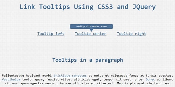
For the links, add the class tooltip-link and an optional position class (left, center, or right). The title attribute provides the tooltip text.
<a href="#" title="This is a helpful tooltip with left arrow" class="tooltip-link left">Hover me (Left)</a>
<a href="#" title="Centered tooltip example" class="tooltip-link center">Hover me (Center)</a>
<a href="#" title="Right-aligned tooltip" class="tooltip-link right">Hover me (Right)</a>
The tooltip itself will be dynamically appended by jQuery as a <div class="tooltip [position]">.
Set the link to position: relative so the tooltip can be positioned absolutely relative to it.
.tooltip-link {
    position: relative;
    text-decoration: none;
    color: #0066cc;
}

.tooltip-link:hover {
    text-decoration: underline;
}
Style the base tooltip:
.tooltip {
    display: none; /* Hidden until jQuery shows it */
    position: absolute;
    bottom: 100%; /* Position above the link */
    width: 220px;
    background: rgba(50, 50, 50, 0.95);
    color: #fff;
    padding: 12px 15px;
    border-radius: 6px;
    font-size: 13px;
    line-height: 1.4;
    z-index: 1000;
    box-shadow: 0 4px 12px rgba(0,0,0,0.3);
    text-align: center;
    pointer-events: none; /* Prevent tooltip from blocking hover */
}
Create the arrow using pseudo-elements (::after and ::before):
.tooltip::after {
    content: "";
    position: absolute;
    bottom: -10px;
    border: 10px solid transparent;
    border-top-color: rgba(50, 50, 50, 0.95);
}

.tooltip.left::after { left: 20px; }
.tooltip.center::after { left: 50%; transform: translateX(-50%); }
.tooltip.right::after { right: 20px; }
Add directional styles for border-radius and arrow positioning. Include subtle fade and scale animations with CSS transitions for smoother effects.
Place the script before the closing </body> tag.
On mouseenter:
- Check if title exists and has content.
- Get the position class (left, center, or right).
- Capture mouse X position relative to the link.
- Append the tooltip div dynamically with the title text.
- Calculate and set left position for proper alignment.
- Fade in the tooltip with jQuery.
$(document).ready(function() {
    $("a.tooltip-link").on("mouseenter", function(e) {
        var $this = $(this);
        var titleText = $this.attr("title");
        if (!titleText || titleText.length === 0) return;

        var positionClass = $this.attr("class").match(/left|center|right/) || ["center"];
        positionClass = positionClass[0];

        // Remove any existing tooltip
        $this.find(".tooltip").remove();

        // Append new tooltip
        var tooltipHTML = '<div class="tooltip ' + positionClass + '">' + titleText + '</div>';
        $this.append(tooltipHTML);

        var tooltip = $this.find(".tooltip");
        var linkWidth = $this.outerWidth();
        var tooltipWidth = tooltip.outerWidth();

        var leftPos = 0;
        if (positionClass === "center") {
            leftPos = (linkWidth / 2) - (tooltipWidth / 2);
        } else if (positionClass === "left") {
            leftPos = 0;
        } else if (positionClass === "right") {
            leftPos = linkWidth - tooltipWidth;
        }

        tooltip.css({ left: leftPos + "px" }).fadeIn(200);
    });
});
On mouseleave, fade out and remove the tooltip:
$("a.tooltip-link").on("mouseleave", function() {
        var tooltip = $(this).find(".tooltip");
        tooltip.fadeOut(150, function() {
            $(this).remove();
        });
    });
- Accessibility: Add aria-describedby dynamically or use role="tooltip". Support keyboard focus with :focus styles. Consider prefers-reduced-motion for animations.
- Responsive: Ensure tooltips don’t overflow on mobile (use media queries or disable on touch devices).
- Performance: Keep DOM changes minimal; use event delegation if many links exist.
- Advanced Options: Add delay, different themes, or mouse-follow tracking with mousemove.
Provide the complete HTML + CSS + JS example. Common issues: z-index conflicts, positioning on responsive layouts, tooltip disappearing too quickly.
Custom tooltips with CSS3 and jQuery offer a lightweight, branded alternative to native tooltips. They improve UX while remaining SEO-friendly. Test thoroughly across devices and browsers, and always prioritize accessibility.
Experiment with colors, animations, and content to match your site’s design. Happy coding!
Here’s a FAQ section for your custom CSS3 + jQuery tooltips tutorial:
Q1: What are tooltips?
A: Tooltips are small pop-up boxes that appear when users hover over a link, button, or element. They provide extra context, explanations, or helpful hints without cluttering the main interface.
Q2: Why use custom tooltips instead of native browser tooltips?
A: Native tooltips (title attribute) are limited in style, branding, and animations. Custom tooltips allow for full control over design, positioning, animation, and responsiveness.
Q3: What technologies are needed to create these tooltips?
A: You’ll need HTML for structure, CSS3 for styling, arrows, and animations, and jQuery to handle dynamic display, positioning, and mouse-follow behavior.
Q4: Are these tooltips SEO-friendly?
A: Yes. Since the tooltip content is derived from the title attribute, search engines can still read it, making it SEO-friendly.
Q5: How can I make tooltips accessible?
A: Use ARIA attributes like role="tooltip" and aria-describedby, ensure keyboard focus support with :focus styles, and respect prefers-reduced-motion for animations.
Q6: Can tooltips work on mobile devices?
A: Yes, but hover doesn’t exist on touch screens. You may choose to disable tooltips on mobile or implement tap-to-show behavior for usability.
Q7: How do I control tooltip positioning?
A: The tutorial shows three positions: left, center, right. jQuery calculates the correct alignment dynamically. CSS pseudo-elements create the directional arrows.
Q8: Can I customize the tooltip style?
A: Absolutely. You can modify colors, font size, padding, border-radius, shadows, fade effects, and animation speed to match your website’s design.
Q9: What common issues should I watch out for?
A: Common problems include z-index conflicts, tooltip disappearing too quickly, improper positioning on responsive layouts, and performance issues with too many tooltips.
Q10: Is it lightweight and fast?
A: Yes. This method uses minimal CSS and a small jQuery script, ensuring smooth performance across modern browsers.
Tinggalkan Balasan