I Style My ALT Text (and You Should Too): How to Make Your Images Accessible and Beautiful When Images Are Disabled in 2026
2 minggu ago
The alt attribute in an <img> tag is one of the most important accessibility features in web and email design. It provides alternative text for users who cannot see images — whether because images are disabled, the user has a visual impairment, or they are using a screen reader.
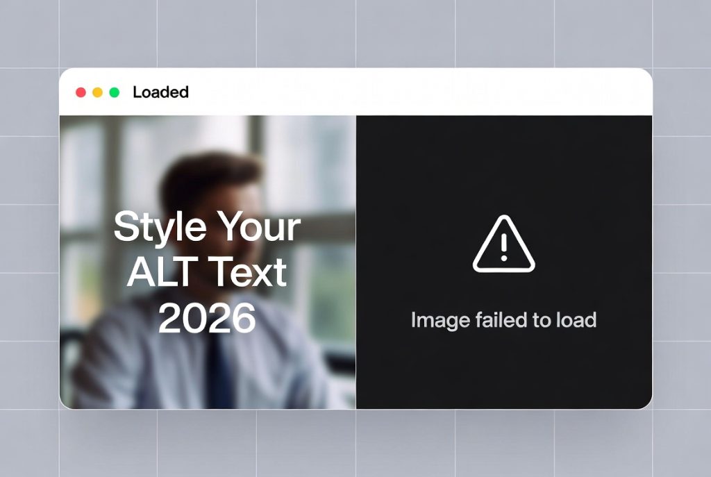
But have you ever stopped to think about what that alternative text actually looks like when images fail to load?
Too often, developers treat alt text as an afterthought — a plain, unstyled string of words that appears in a default browser or email client font. The result can be ugly, hard to read, and inconsistent with your brand.
In this updated 2026 guide, we’ll show you how to style your ALT text so that it looks intentional, on-brand, and accessible — even when images don’t load. We’ll use a practical email template example (as email clients are notoriously strict with styling), but the principles apply equally to websites.
By the end of this article, you’ll understand how to make your ALT text not just functional, but visually appealing and user-friendly across different platforms and devices.
In 2026, accessibility is no longer optional. Laws like the ADA, WCAG 2.2, and the European Accessibility Act require proper alternative text for images. But beyond compliance, styled ALT text improves user experience for everyone.
When images fail to load (due to slow connections, email client restrictions, or user preference), well-styled ALT text maintains your design integrity and brand voice.
Key reasons to style ALT text:
- Improves readability in email clients (Gmail, Outlook, Apple Mail)
- Enhances accessibility for screen reader users
- Maintains visual consistency when images are blocked
- Supports dark mode and responsive designs
- Builds trust and professionalism
Many email clients strip or heavily restrict CSS, but certain techniques still work reliably for ALT text styling.
Before styling, ensure your ALT text is meaningful:
- Be descriptive but concise
- Include context (e.g., “Company logo” instead of “logo”)
- Avoid keyword stuffing
- Use empty ALT (alt="") for decorative images
- Don’t repeat surrounding text
Example:
<img src="hero-banner.jpg" alt="Summer sale: 50% off all outdoor furniture" width="600" height="300">
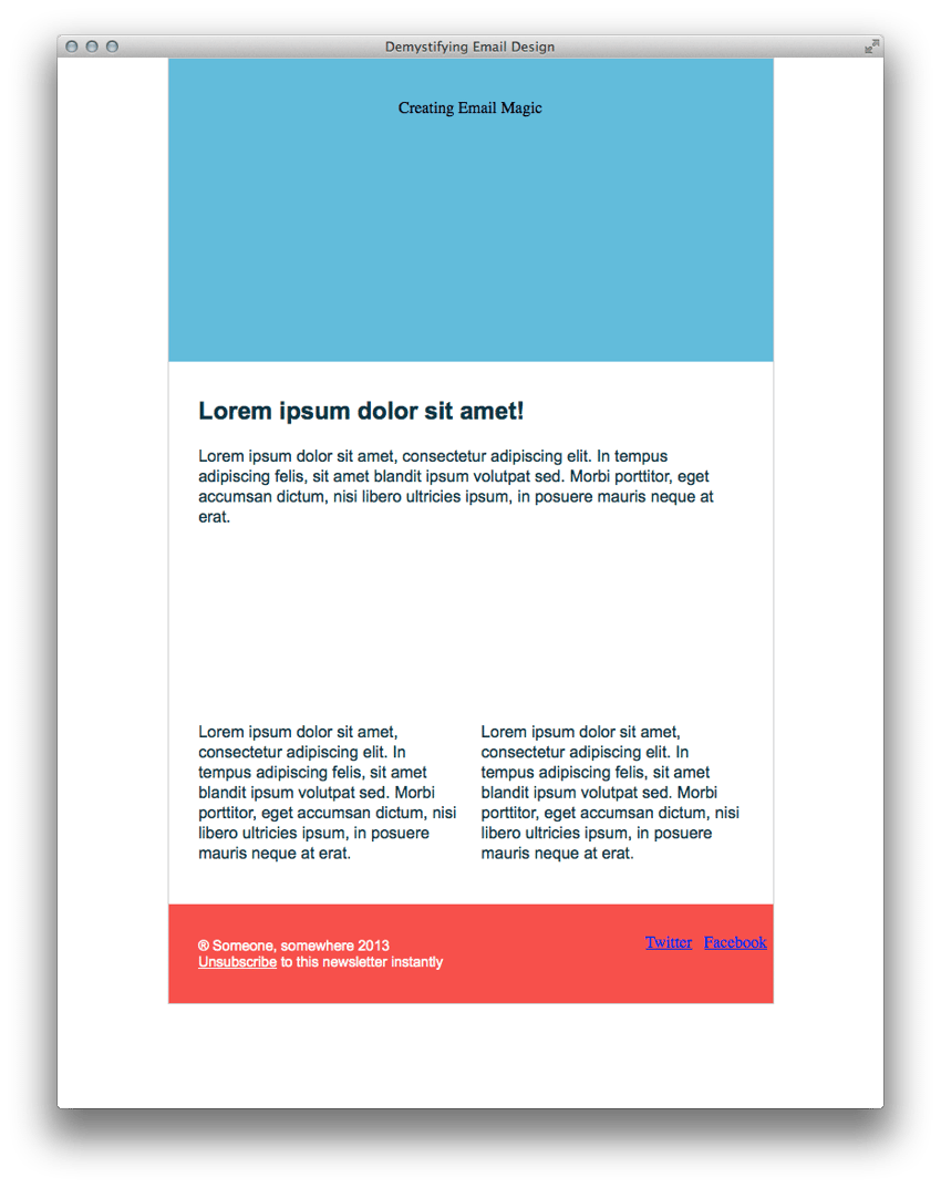
Technique 1: Style the Parent Container
The most reliable way to style ALT text in emails is to apply styles to the parent <td> or <div>:
<td align="center" bgcolor="#70bbd9" style="padding: 40px 0 30px 0; color: #153643; font-size: 28px; font-weight: bold; font-family: Arial, sans-serif;">
    <img src="images/h1.gif" alt="Creating Email Magic" width="300" height="230" style="display: block;" />
</td>
This makes the ALT text inherit the color, size, weight, and font family.
Technique 2: Style Links Inside ALT Text
For social media icons or linked images:
<td style="font-family: Arial, sans-serif; font-size: 12px; font-weight: bold;">
    <a href="https://twitter.com/" style="color: #ffffff;">
        <img src="images/tw.gif" alt="Follow us on Twitter" width="38" height="38" style="display: block;" border="0" />
    </a>
</td>
Technique 3: Dark Mode Support
In 2026, many email clients support dark mode. Use media queries or prefers-color-scheme where supported:
@media (prefers-color-scheme: dark) {
    td[style*="bgcolor"] {
        color: #ffffff !important;
    }
}
Technique 4: Responsive ALT Text
Ensure ALT text remains readable on mobile by using relative font sizes and sufficient line height.
Test your styled ALT text in:
- Gmail (web and app)
- Outlook (desktop and web)
- Apple Mail
- Yahoo Mail
- Mobile devices (iOS and Android)
Tools like Litmus, Email on Acid, or free services can help preview how ALT text appears when images are disabled.
- Use semantic markup where possible
- Combine ALT text with ARIA labels for complex images
- Test with screen readers (VoiceOver, NVDA, TalkBack)
- Avoid relying solely on color for meaning
- Keep ALT text under 125 characters when possible
Styling your ALT text is a small but powerful way to improve accessibility, maintain brand consistency, and enhance user experience when images fail to load. In 2026, with stricter accessibility regulations and higher user expectations, taking the time to style ALT text properly is no longer optional — it’s essential.
Simple techniques like styling the parent container, using appropriate fonts and colors, and testing across clients can make a big difference. Your emails and websites will look more professional and inclusive, even in the worst-case scenario of images being disabled.
Start applying these techniques today and make your ALT text as beautiful as the images it replaces.
FAQ (Frequently Asked Questions)
Q1: What is the ALT attribute in an image tag?
A: The ALT attribute provides alternative text that describes an image when it cannot be displayed or for users relying on screen readers.
Q2: Why is ALT text important?
A: ALT text improves accessibility, helps visually impaired users understand content, and ensures information is still available when images fail to load.
Q3: Can ALT text be styled with CSS?
A: Direct styling of ALT text is limited, especially in email clients. However, you can style the parent container so the ALT text inherits fonts, colors, and spacing.
Q4: What is the best way to style ALT text in emails?
A: Apply styles to the parent <td> or <div> (font, color, size) so the ALT text appears visually consistent when images are blocked.
Q5: How long should ALT text be?
A: Ideally under 125 characters, concise but descriptive enough to convey the image’s purpose.
Q6: Should all images have ALT text?
A: Informative images should have descriptive ALT text, while decorative images should use empty ALT (alt="").
Q7: Does ALT text affect SEO?
A: Yes, ALT text helps search engines understand images and can improve SEO when used naturally and appropriately.
Q8: How do I test ALT text visibility?
A: Disable images in your browser or email client, or use testing tools like Litmus or Email on Acid to preview how ALT text appears.
Tinggalkan Balasan